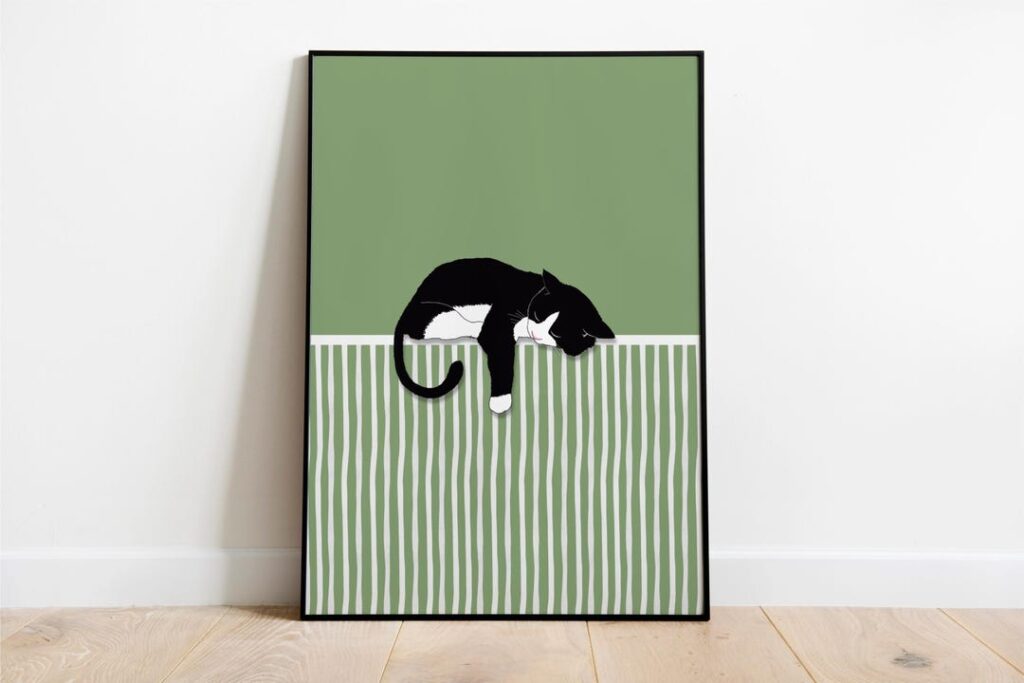
Two of Elif’s prints share the same idea: a black cat stretched out lazily, drawn simply against a bold block of colour. One sits on mustard yellow, the other on matcha green. They’re close cousins, but they behave very differently in a room.
This guide helps you choose between them, or decide to hang both.
Why a single strong colour works so well
A print built on one large field of colour reads clearly from across the room. Instead of adding lots of small details to a wall, it adds one confident shape and one colour. That makes these prints easy to style in colourful homes: they give the eye a place to rest, while still bringing personality.
Yellow or matcha green?
Choose the yellow cat if…
- Your room has cool or neutral tones, such as white, grey or pale blue, and needs some warmth.
- You want the print to be the brightest thing on the wall.
- The room gets little daylight. Yellow brings a sunny feeling even on grey days.
- You have warm wood, rattan or terracotta nearby: yellow sits naturally beside them.
Choose the matcha cat if…
- You have plants in the room. The green links the print to them.
- Your space already has plenty of colour and you want something calmer.
- You like earthy palettes: sage, olive, cream, natural linen.
- The print is going in a bedroom or a reading corner where a softer mood suits better.
Product images below are room mockups, not photos of finished prints.
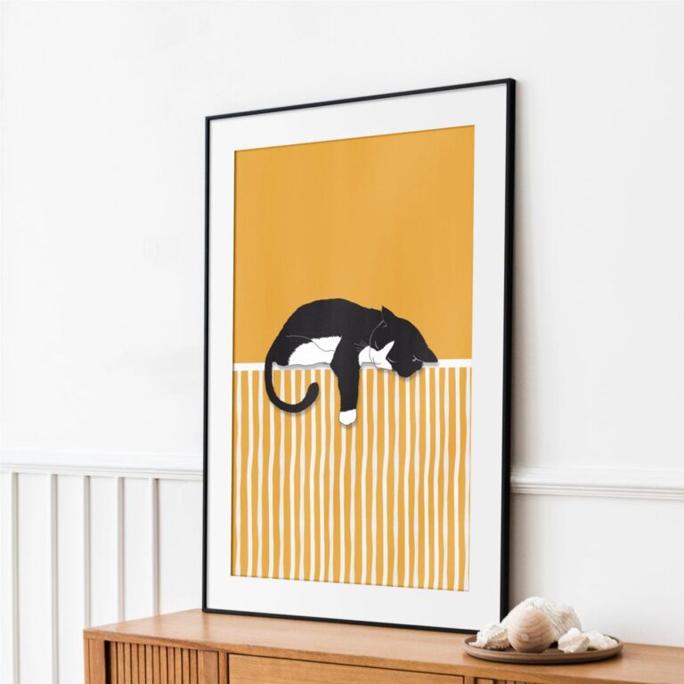 Printable wall art · Digital downloadBlack & White Cat on YellowView this print on Etsy
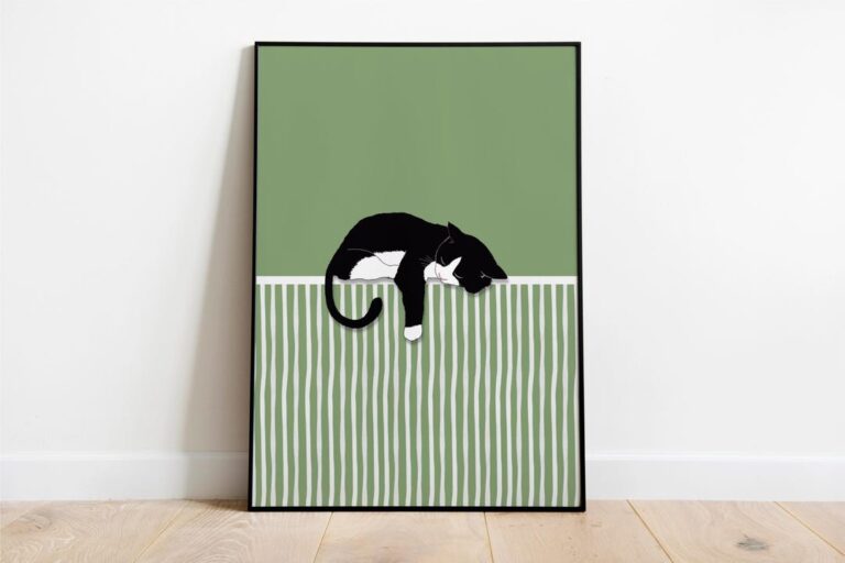 Printable wall art · Digital downloadMatcha Green CatView this print on Etsy
Hanging both together
Because the two prints share a drawing style and composition, they make an easy pair. Side by side, they create a small “colour story”: the same cat, two moods. A few tips:
- Use identical frames and the same size so the colours do the talking.
- Leave a gap of about 5–8 cm between frames. Too far apart and they stop reading as a pair.
- Hang them so the cats face or mirror each other if the composition allows. It feels more intentional.
Choosing a frame
- Black frames pick up the black cat and give a crisp, graphic look.
- Natural oak softens both colours and suits Scandinavian or Japandi rooms.
- A white mount gives the colour block some breathing space, especially in a busy room.
A cat print without a “cat room”
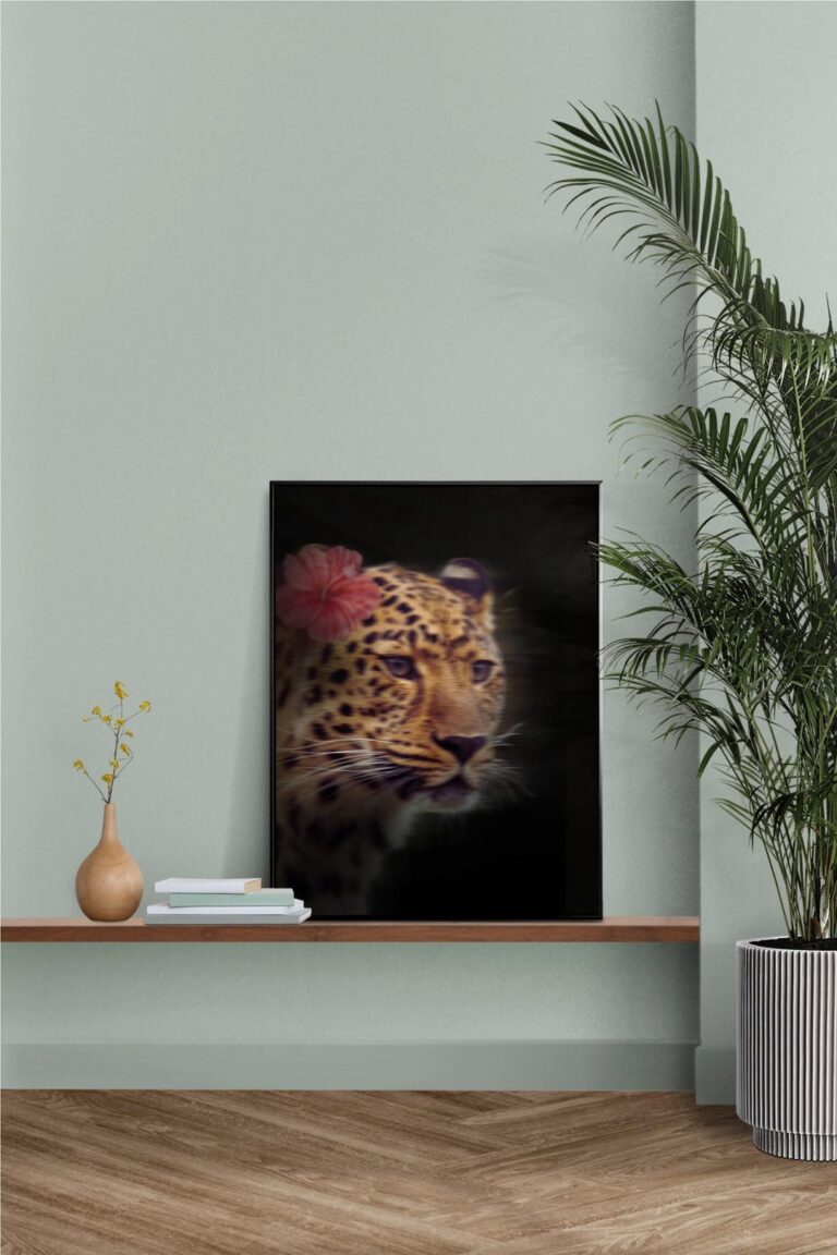
A good animal print doesn’t need a themed room around it. Treat it like any other artwork: think about colour and scale first, subject second. The same goes for Elif’s Floral Leopard, a moodier option with flowers set against a dark background, which works well in a room with deep colours or warm lighting.
Before printing, check our guide to sizes and aspect ratios so the colour block isn’t trimmed by the frame.