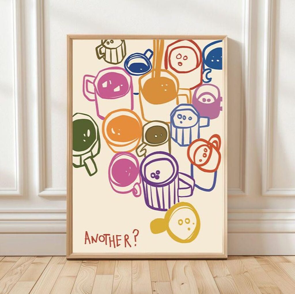
A wall of perfectly matching prints can feel a little like a hotel corridor. Mixing different prints is what makes a home feel collected over time, but it’s easy to end up with a wall that just looks random. Here’s how to mix with confidence.
Find one thread that connects them
Prints don’t need to match; they need to relate. Pick one thing they share and let everything else vary:
- A shared colour: yellow in one print, yellow in another, even if the subjects are completely different.
- A shared style: work by the same illustrator naturally belongs together.
- A shared mood: playful, calm, nostalgic or moody.
- A shared frame: identical frames make very different prints look like a set.
Vary the scale
Mixing one larger print with smaller ones gives the eye a starting point. If every print is the same size and equally busy, nothing stands out.
Balance busy and quiet
Put a detailed print next to a simpler one. A colourful doodle print feels fresher next to a minimal line drawing than next to another busy design.
An example mix
Product images are room mockups: they show how a print could look on a wall, not photos of a finished print.
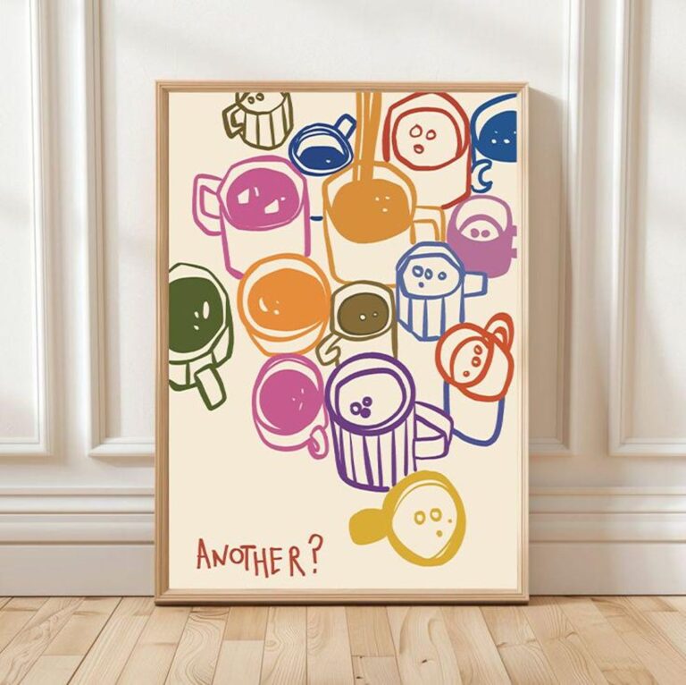 Printable wall art · Digital downloadDoodle Coffee MugsView this print on Etsy
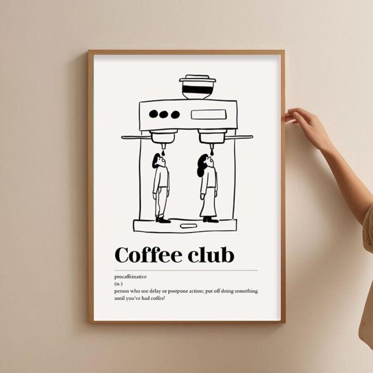 Printable wall art · Digital downloadCoffee Club Espresso PrintView this print on Etsy
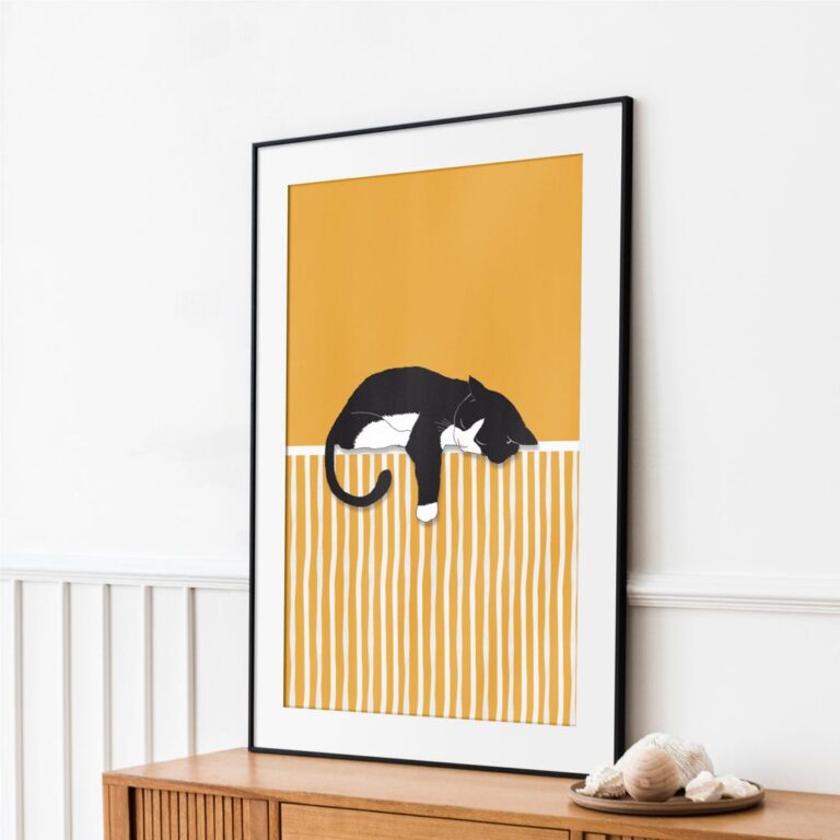 Printable wall art · Digital downloadBlack & White Cat on YellowView this print on Etsy
- Doodle Coffee Mugs brings colour and energy.
- Coffee Club is calm line work and connects through the coffee theme.
- Black & White Cat on Yellow picks up the black lines and adds one warm colour block.
Rules you can break
- Matching frames: mixed frames can work if they share a colour family, such as all wood tones.
- Same subject: a cat, a swimmer and a coffee machine can share a wall if the palette connects them.
- Symmetry: an uneven, organic arrangement often feels more relaxed.
Start small
Try two or three prints first. Our guide to a simple three-print gallery wall shows easy layouts, and our colourful home guide covers choosing colours.